
4/12/2024: NEW UPDATE!!
As you can clearly tell at this point, my website has been completely revamped!! I redid all the code, and made all new assets for it, between the header and the background and the favicon, etc... This was definitely a good idea I realize now, but I was initially worried it would be nearly as time consuming as it was when I made the first website iteration. It took me months to make the first one, which was 100% because I was learning how to code HTML and CSS in real time, as I went. So, I was initially kind of upset when I realized it definitely would benefit from a revamp, because I was expecting this to take at least a month - it didn't. Two whole days of active work. It was so easy and fast I was a little surprised, but it's definitely helpful to better understand the workload for things like this.
Prior website issues fixed in this version
While my last website was generally functional, it had some minor issues that made me completely insane and that I really struggled to fix due to a lack of organization. My biggest issue was with how the navbar and body would scale terribly, fluctuating size by page for reasons that are still entirely unknown to me. I've included an image below of what the website used to look like for anyone who didn't get to see it before.
The navbar on the left side, as you can see, were displayed as images - image links in particular, which I obviously had never worked with before, because I had never coded a website in full before, and I didn't realize until I had already latched onto them as a mathod that they are entirely UNRESPONSIVE PIECES OF SHIT. Like, I'm sure there's SOME way to make them scale to different sizes, but I couldn't find it for the life of me. Any time I tried coding them to display at their genuine size, which was 900px wide (for reference, the header on this site right now is 1000px. This is a pretty decently sized aspect ratio, and it takes up a little under half the screen on my larger desktop monitors) they would display TINY. Like, maybe 30px wide at most. So, when i had to code them in, I made them some absurd scale like 300% their "original" size, hoping this would get them to adjust and scale down on mobile-sized screens. It did not. Instead, while they would generally display correctly, and with the help of flexbox elements I got them to sit at the top of the screen at mobile aspect ratios which prevented them from displaying off-center and off-screen, their size simply would NEVER budge regardless of the code fed into it. Regular images do not react the same way image links do, and I couldn't tell you why for the life of me, because many of the elements I was trying on the image links also generally work on text-only elements as well. It's not like the image link was considered more of a link than an image, I think it was moreover my fault for choosing a more outdated form of navbar visuals. I seriously have no idea how else you're supposed to create a navbar with images, because every tutorial made in the last decade or more doesn't even really humor the thought of using anything other than text for your navbar. There are obviously other things to consider, obviously mobile scaling is easier when you don't need to consider an image's aspect ratio, plus something tells me I'm not the first person to have terrible issues with image link mobile scaling, but it's also definitely more user-friendly to load as few images as possible into your site. For most people it's not an issue, but rarely some people are just viewing your site on an absolute brick of a PC, or their internet connection is being fed to them like it's the 1970s. Not trying to be mean to those people, I'm just saying it's a genuine demographic to consider. This is also why I'm such a hardcore Javascript hater.
The way image links would fail to scale hugely affected my capacity to standardize the layout of my site in its old iteration. As I said, I somehow found a way to maneuver around this by moving the elements around the image links rather than the image links themselves, but that made it so the size of the navbar and the text body would differ between pages. Publicly, the site only had a homepage and a links page, but there was also a secret third "portfolio" page I sent as part of an application once, and while the home and links tabs had only a minor difference, the scaling issues within the portfolio page were massive. Still, I feel the need to reiterate, I have no clue why and I doubt I'll ever be able to find out, because it was a frustrating and fruitless endeavor before when I actually had the motivation of, "other people can see this, this is the publicly available code". Now, it's obsolete, and even if I wanted it back, I would easily take coding it from the ground up all over again over sorting through that mess. The way the formatting would fail was ugly - in code, the navbar was supposed to take up about 30% of the screen, and the body took the remaining 70%. Even accounting for padding and margins, this was completely impossible to implement. I think the body size was defaulting to a certain width depending on the quantity of text contained within it, because I realized the more I typed on a given page, the further left the body would creep, which led me to pad out the links page with unnecessary fluff about the websites I linked even though I really had nothing to say. It's not that I feel bad about that, I just found it frustrating, like trying to reach a word limit on an essay - but imagine if you didn't even know what the word limit is, and everything you typed was just always slightly off. For such a minor scaling issue that I never had anyone point out to me but that I noticed myself quick, I really didn't know if it was worth the wasted time either. It made me feel a bit embarassed to send a link to certain corporate professionals to show my technical knowledge, only for them to recieve a website that had some deeply fucked scaling problems. They did reject me but I firmly believe that's their loss regardless, even if the site did suck. The temporary solution I resorted to was setting the buttons to a fixed width, demanding they take up a certain size of the screen. This further fucked up mobile scaling, and simply filled in the weird gaps that formed inbetween the buttons and the text body when things really went awry. A lot of those problems are probably because I had both an html style guide and a css document. My best guess is that they were fighting for custody or something.
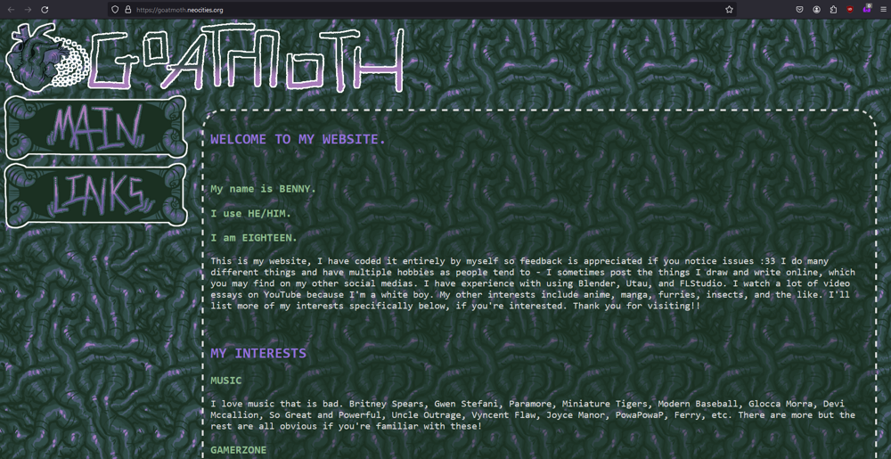
The horrors of Stack Overflow
While building this site, it was not free of problems either. I am very pleased with how it exists in its current form, but it used to similarly have issues with navbar scaling, albeit in a different way. The links underneath the header would clump together in the middle, not filling out the sides like it does now. This time, I knew it was specifically due to the presence of a certain command under the flexbox container that aligned all visible elements to the middle of the screen. I tried many variations on fixing the code that very first day, but nothing worked by that point. I was very desperate and incredibly frustrated, so I decided to post on Stack Overflow, which in theory is supposed to be coding support for dummies. I wrote my first post there, three paragraphs long, featuring images of my problem and all the CSS contained on my site. This was the exact image I included to demonstrate my issue with the incorrect alignment of the navbar.

If I had managed to fix this issue on that first day, it would have only taken one day of work instead of two. What happened instead - I got so frustrated with this problem that I stopped for the day and went to bed, expecting to see a reply to my SO post in the morning. When I checked, I did recieve a reply, but it was just some guy commenting to tell me my post sucked. He asked for HTML (which was barely applicable outside of understanding the placement of div elements, it was a centrally CSS issue and one I eventually solved within CSS alone), which I added to the post, but what was most insulting about the comment was a suggestion he gave me to better fix my question. He linked to a post titled, literally, "how to ask a good question". Do you, maybe, potentially, have any clue how insulting this felt to me personally? Like, obviously the wording here is wildly passive agressive, and I was already uneblievably frustrated with this one problem - I was really upset I couldn't knock it out in that singular day, and this was a problem that I had been sitting on all night since I shut my PC off, and now some guy is telling me that I can't be helped because I made the horrible sin of writing a bad question. I still completely fail to understand what was bad about it, because beyond the inclusion of HTML, I never recieved any specific criticism as to why my problem or my wording was obfuscated. But, I figured, this guy didn't write the passive-agressively titled help article, he maybe didn't even understand HTML or CSS enough to help me, and if adding this clarification will attract someone who actually knows and can help, then I'm down. I couldn't even bring myself to do anything about the problem that day, so it was effectively a non-work day.
The next day, I log on again, still hoping someone saw my problem and replied. I got another notification, and I was excited initially, only to find out it was just some stranger reformatting my code to make the syntax correct. This didn't bother me, because he didn't say anything mean about it like the last guy, but it really sunk in for me at that point that nobody will help me. My post is two days old, it's buried under every other post that's been made in that timespan, I might as well just buckle down and really find a solution here. And I did, eventually - it was the use of "display: flex" in particular that messed me up. I needed to try other display options, and I also learned more about the functionality of media queries to ensure the site body didn't appear too thin on mobile screens. This fix amounted to literally two short lines of code - it was hardly anything. I felt way better having it out of the way, but I decided to post it as the solution to my own neglected post, to guarantee anyone else who stumbled upon it wouldn't have the same issue, and for the rest of the day I moved on to uploading my site. The next day, I got an email telling me my post had been closed - this was really confusing, I don't see the point in closing a post that's already been resolved, especially since the listed reason for closure was "lack of clarity". This sparks an obvious question for me. I had never used SO before then, but this has gotta be some kind of severe incompetence - I've seen tons of other people on Neocities who are wayy better at coding than I am, everything I do is super simple and short, so where even could confusion have occured? If you know anything about HTML or CSS, you can literally go into my source code right now and view them if you'd like to confirm. Does nobody on Stack Overflow actually know how to code? Is it one of those circlejerk websites where people just use it to feel better about themselves by pretending they can code? Scroll through the recent posts on it right now - how many problems do you see that have more than 3 answers? I just think it's really abysmal that I can honestly say I've gotten a warmer reception on Reddit, and I don't have any friends with similar interests in these things as me, so this is where I must complain about it sadly...
That's all I have to say for today :) Sorry this post is a few days later than promised, I got caught up finding more links for the links page (which I haven't even added yet, but will soon) and forgot all about this. I can't guarantee when my next blog post will be, but I'll try to fit a gallery post inbetween this one and the next one. I'm getting major surgery on the 29th, so maybe I can make a post about that when it happens. Thanks for reading!